Vibrant, Bold, Unique...
Make it fun!
Outcome
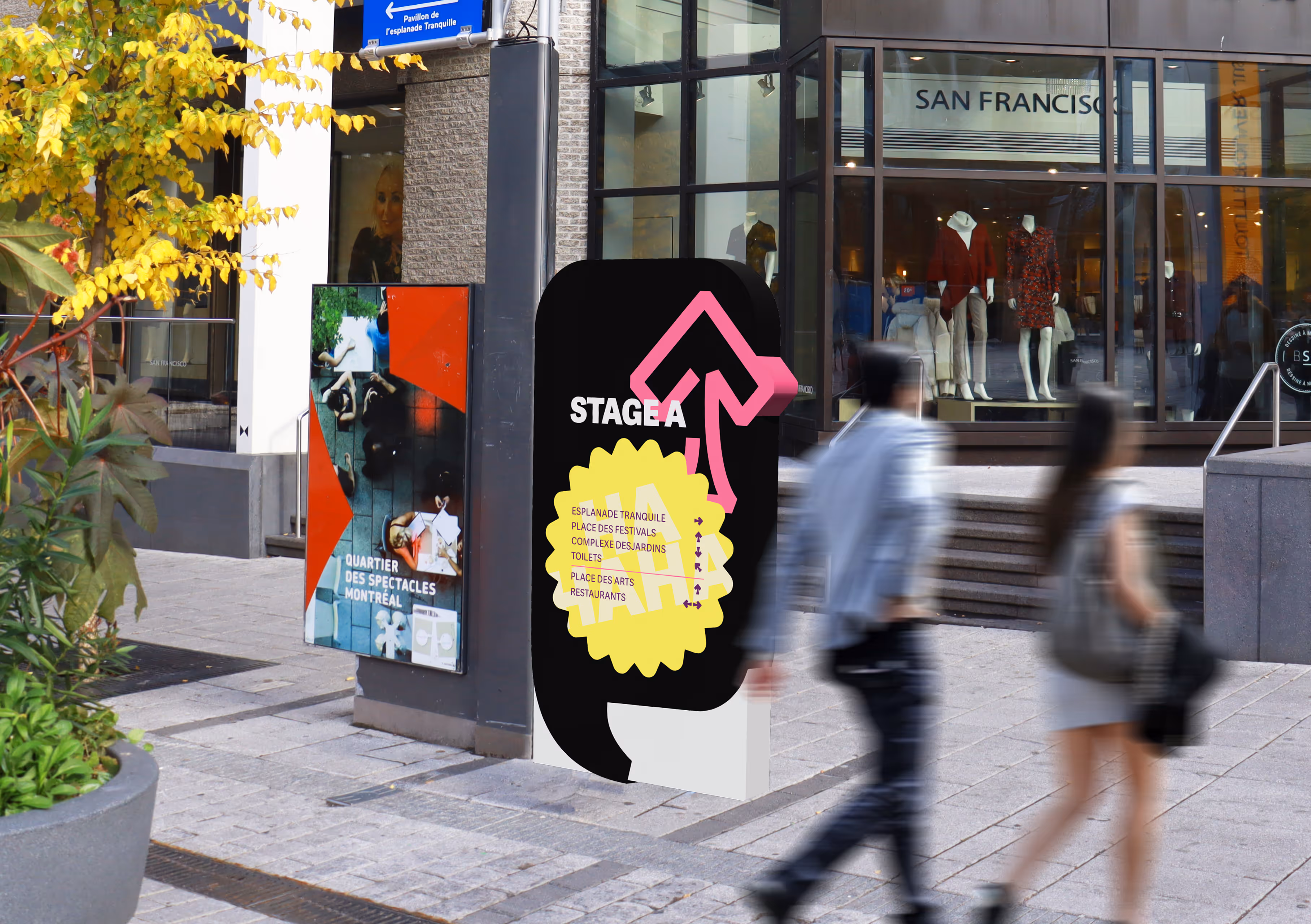
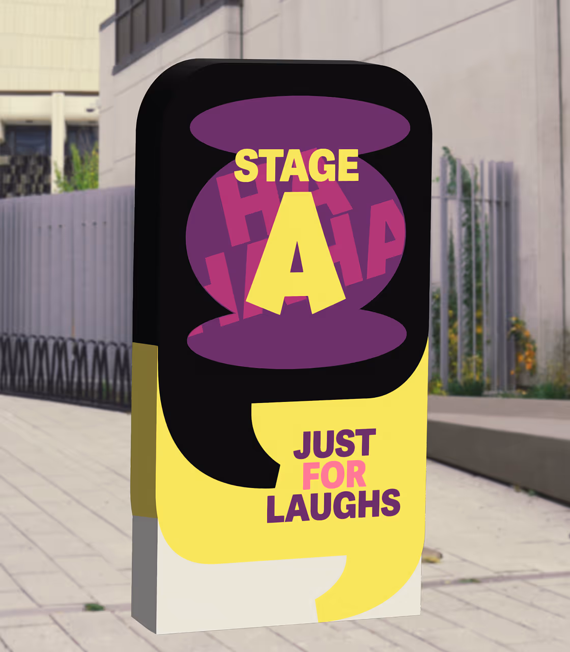
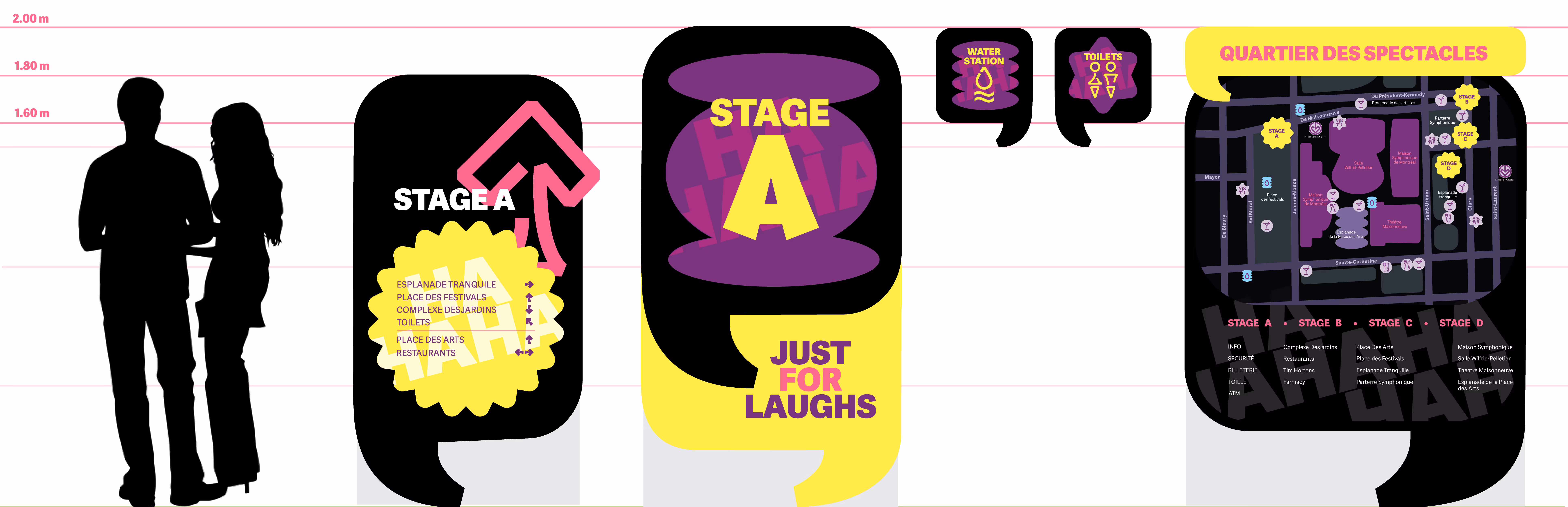
The final visual focusses on being vibrant through the color and type selection. The color palette is funky, with contrasting saturated colors: yellow, magenta, purple and black. I wanted to play with geometric shapes as well and add speech bubbles because the festival involves a lot of dialogue and communication.
I created a family of geometric shapes to go into the different types of signs and a family of icons that would blend well with the overall energy, taking an innovative approach for them.
For the type, I wanted to keep it similar to what they currently have and keep it sans serif, bold and geometric. Lastly, the materials for the visuals are acrylic for the main design that’s over a metal base so that it stands without issues when people pass by. Each visual element is printed separately and then placed together so that each piece has a better color accuracy.