Nils Petter Molvær, Norwegian trumpet player, composer and producer, who takes multiple music styles – jazz, ambient, house, electronic and break beats, as well as elements from hip hop, rock and pop music – and effortlessly reshapes them into unique and dramatic soundscapes of deep intensity.
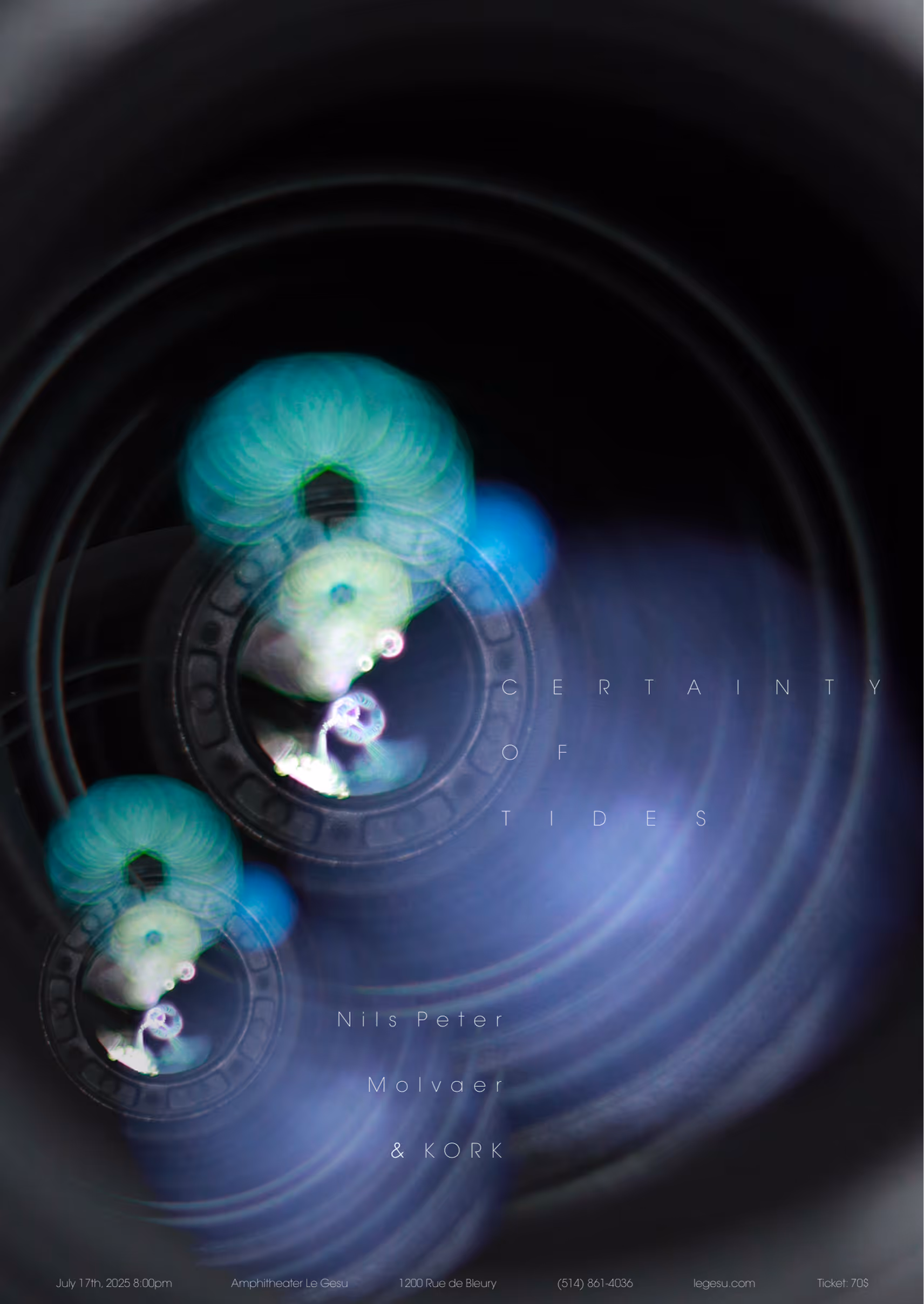
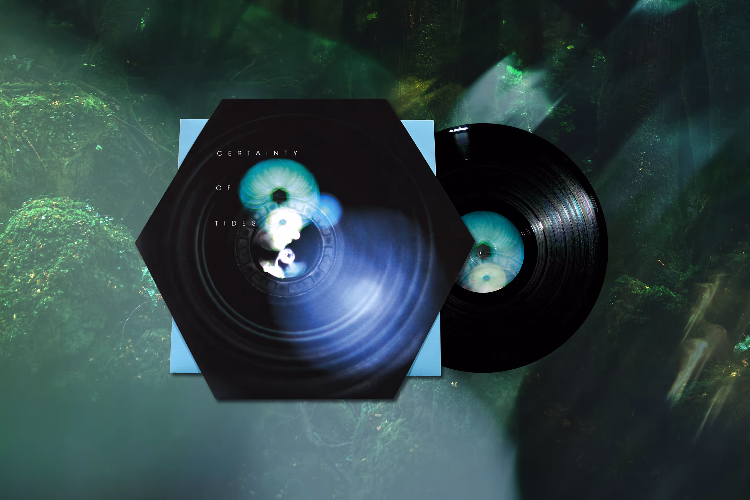
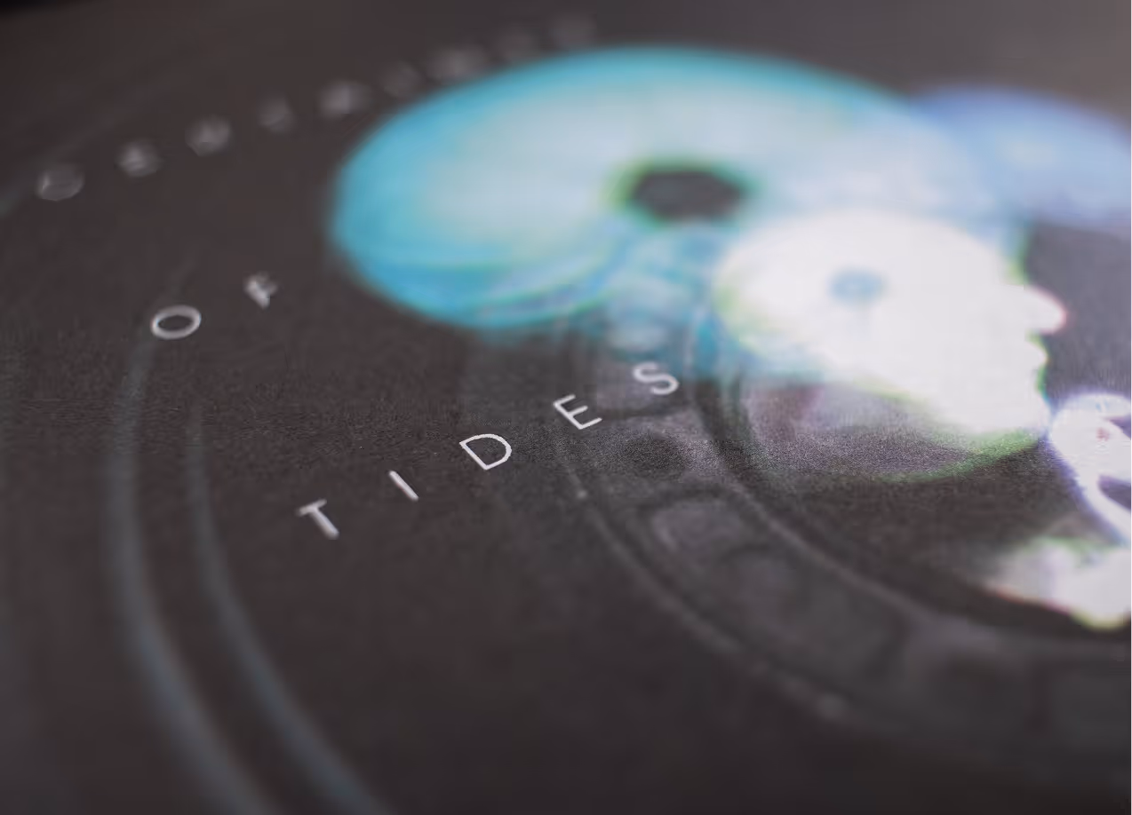
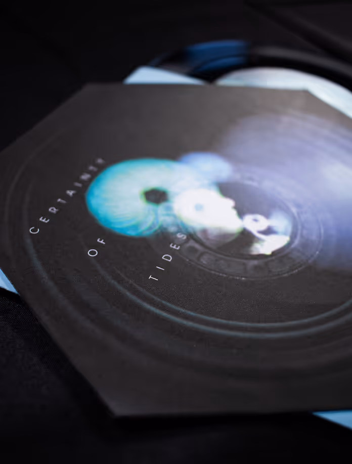
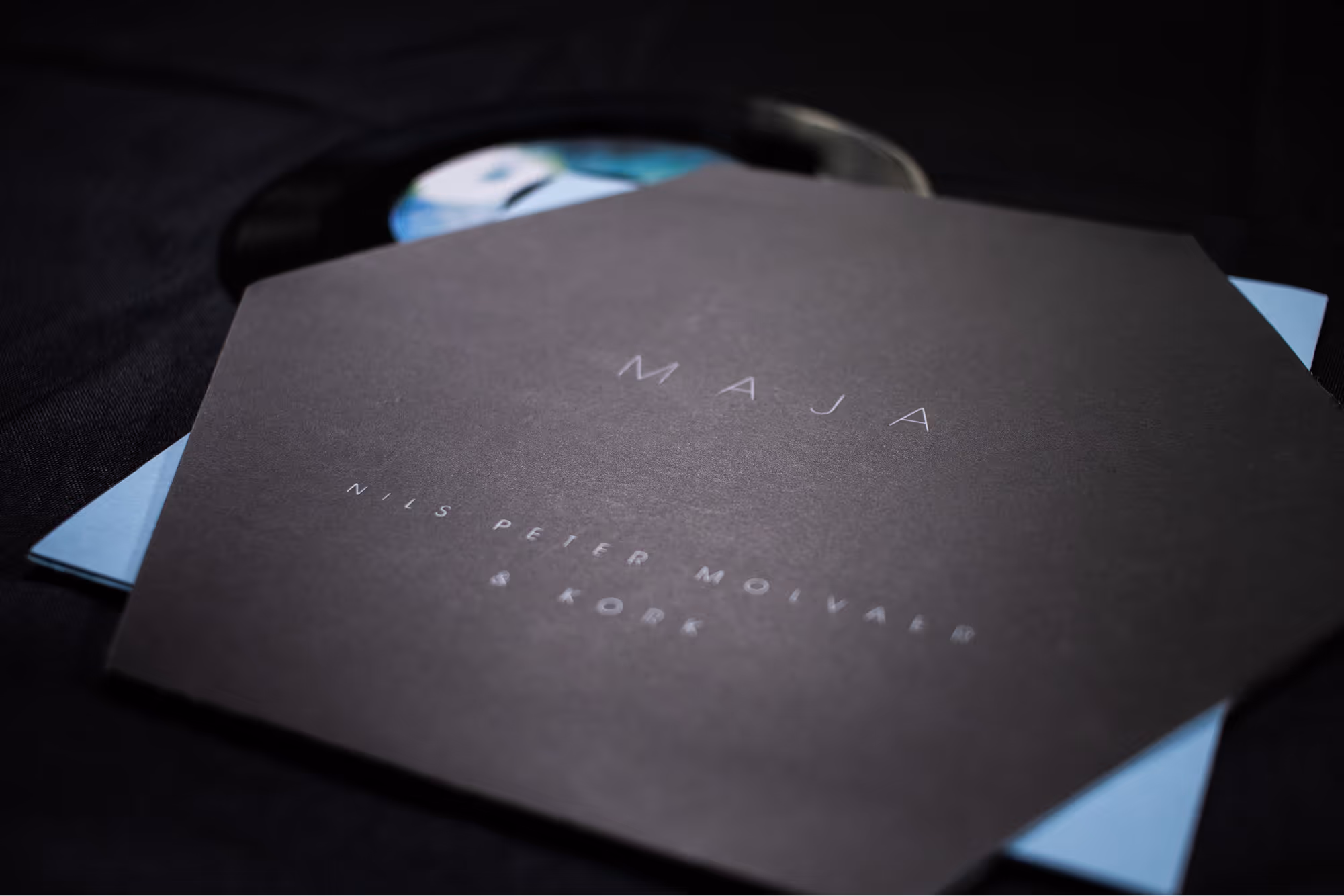
The album "Certainty of Tides" is a captivating collaboration between Molvær and the Norwegian Radio Orchestra. Released by Modern Recordings, this mesmerizing musical journey combines the unique talents of Molvær and KORK orchestra to create a truly extraordinary listening experience.
The mandate is to create a promotional poster and social media ads for a concert for Nils’s album and subsequently design a vinyl packaging for it. The combination of Molvær's improvisational skills and the orchestral arrangements creates a sense of depth and complexity that keeps listeners engaged from start to finish. As a result, it sounds magical and inspired by nature, so its approach should be delicate and refined. On the same way, the music feels like the narrative of a story, mysterious and deep so going for an abstract visual would work best.

The final visual concept focuses on depth, atmosphere, and the feeling of entering another world — much like the experience of listening to the album. Using photography allowed me to create a realistic yet surreal sense of space, evoking the idea of portals and layered dimensions. The typography is geometric, thin, and understated, ensuring the imagery remains the focal point while maintaining an elegant, refined composition. Together, these elements create a visual identity that feels delicate, immersive, and aligned with the album’s sonic landscape.
The vinyl design extends the project’s ethereal, immersive tone through an unconventional format. The jacket takes the shape of a hexagon, giving it a whimsical, otherworldly presence that echoes the album’s sense of depth and mystery. The main photograph from the poster remains the focal point, while thin, elegant typography is printed in white ink to preserve the delicate visual balance.
Inside, the sleeve returns to a traditional square format, allowing its corners to peek out from the hexagonal jacket and subtly reinforcing the layered, portal‑like concept. The disc label itself resembles an eye, adding a final touch of intrigue and reinforcing the idea of entering another world through the music.


