Exploring Narrative,
cuisine, and tradition...
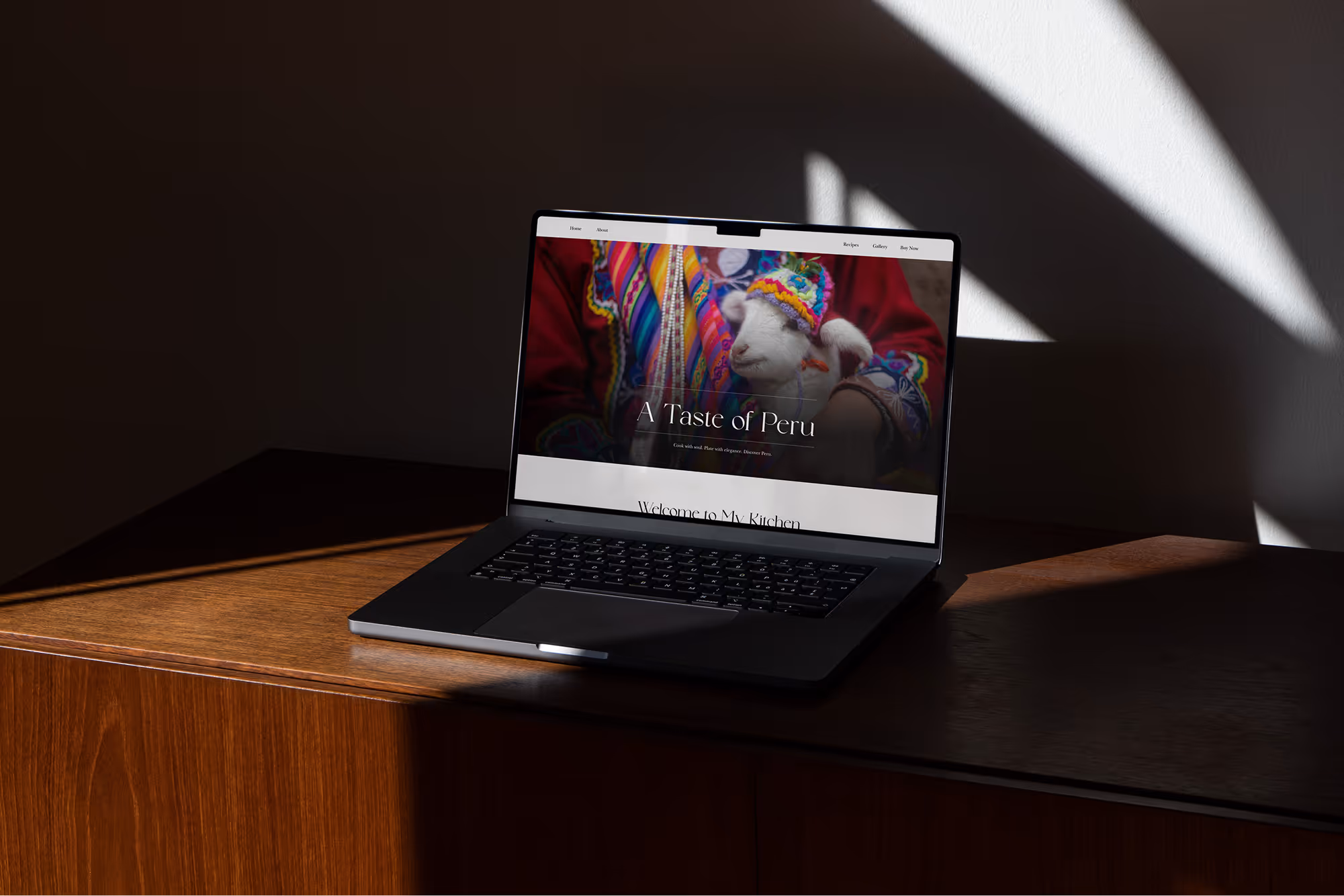
About
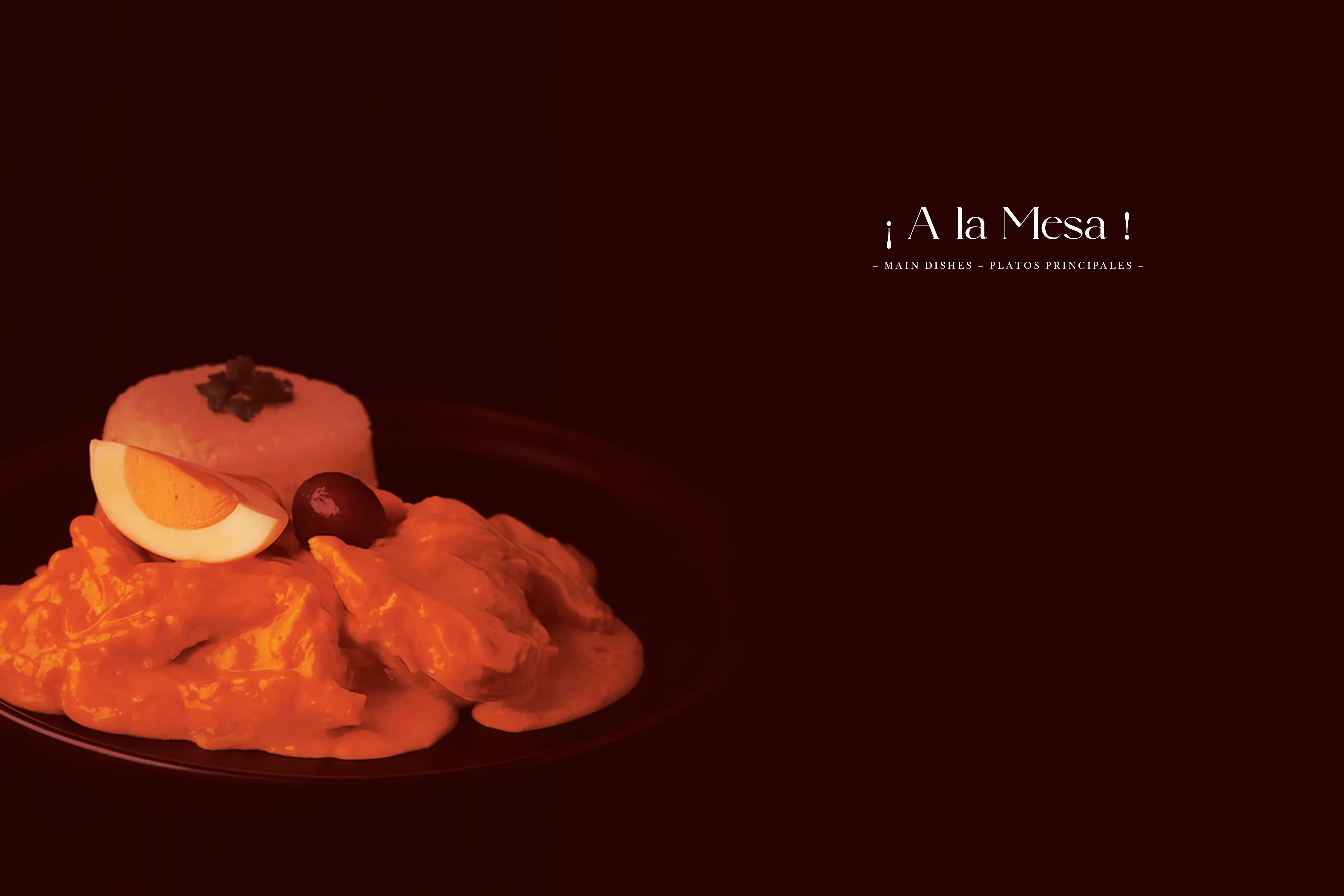
This cookbook is a culinary experience, for adventurous people, on ethnic food. The recipes are a mix of tradition and haute–cuisine, aiming to immerse people into Peruvian culture.
Approach
The mandate is to create a high–end cookbook and make a promotional website for it. When I was given the subject for this book, I was excited to work on something that I’m familiar with, since I’m Peruvian and I have a good insight of the culture and content of the book. In this case, I was aware that the goal of this cookbook is to reach people who aren’t familiar with it, so making the layout minimal and attractive is a good way to achieve that. The recipes are easy to follow, step by step, and the photography is bold and moody. To target the high-end finish of this product, a classy approach would be best.